
27 Room Color Ideas Bedroom Makeovers That Look Incredibly Expensive
- Warm Greige Walls with Crisp White Trim
- Deep Charcoal Accent Wall Behind the Bed
- Muted Sage Green for a Calm, Organic Feel
- Rich Terracotta for Old World Warmth
- Soft Blush Pink Paired with Black Accents
- Navy Blue Walls with Gold Hardware
- Warm Taupe with Layered Neutral Textiles
- Deep Forest Green for a Moody Retreat
- Creamy White with Textured Plaster Finish
- Dusty Blue with White Millwork
- Rust Orange Accent Wall
- Soft Olive Green with Brass Details
- Warm Gray with Black Window Frames
- Deep Plum for Dramatic Elegance
- Pale Yellow with White Linens
- Chocolate Brown with Cream Accents
- Soft Lavender for a Subtle Statement
- Two-Tone Walls with a Painted Chair Rail Line
- Warm White with Natural Wood Tones
- Slate Blue-Gray for Sophisticated Calm
- Deep Burgundy Accent Wall
- Soft Peach for Warm, Flattering Light
- Matte Black Accent Wall with Warm Lighting
- Soft Clay Pink for Grounded Warmth
- Ivory with Textured Wallpaper Accent
- Deep Teal for Bold, Sophisticated Contrast
- Soft Gray-Green with Layered White Textiles
27 Room Color Ideas Bedroom Makeovers That Look Incredibly Expensive
You don’t need a designer’s budget to make your bedroom look like it belongs in a magazine spread. Most of the time, the difference between a room that looks cheap and one that looks custom comes down to color choices. Pick the right palette, pair it with the right finishes, and suddenly your bedroom reads as intentional instead of thrown together. Here are 27 color ideas that punch way above their price tag.
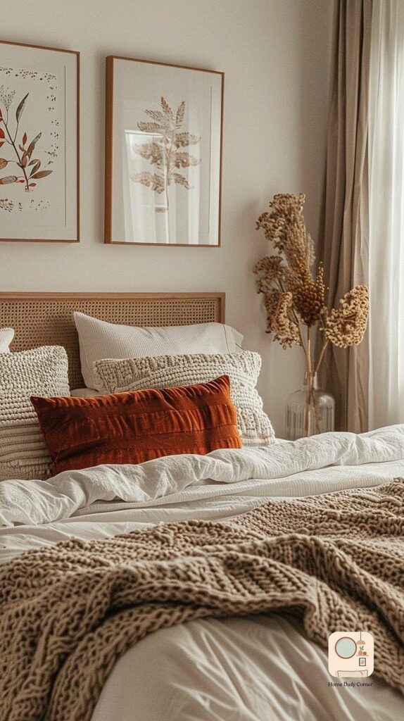
Warm Greige Walls with Crisp White Trim
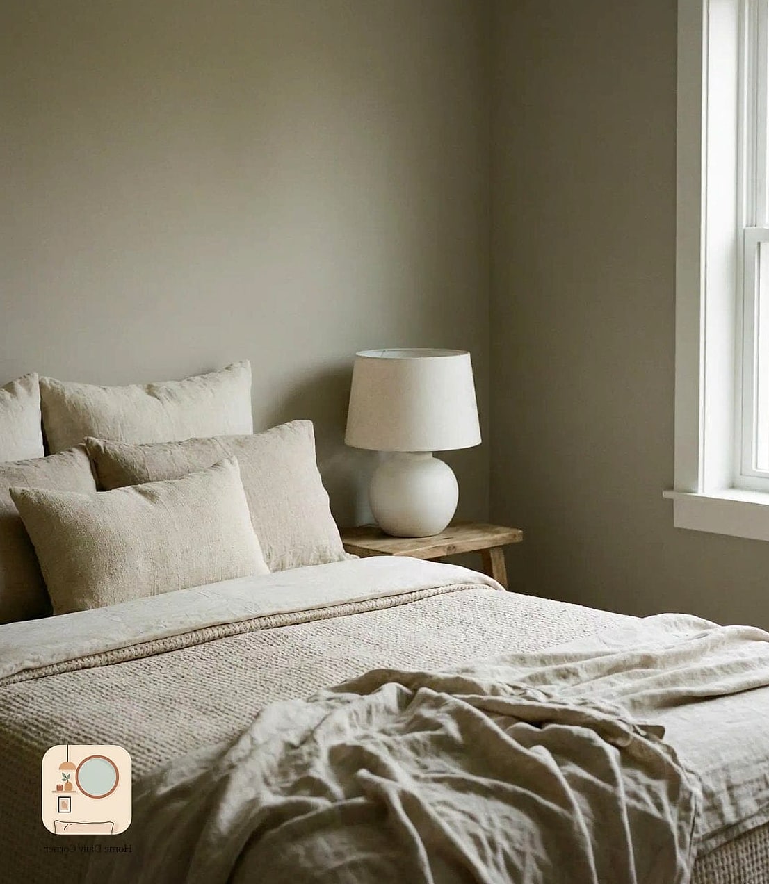
Greige has stuck around for a reason. It’s warmer than a flat gray but still neutral enough to feel sophisticated. Painting the walls in a soft greige and keeping the trim bright white creates contrast without feeling stark. This combo works in almost any lighting situation, which makes it a safe bet for bedrooms with tricky windows. It photographs beautifully too, if that matters to you.
Deep Charcoal Accent Wall Behind the Bed
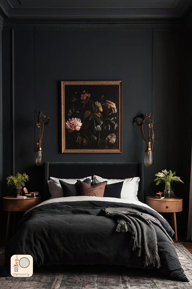
A single charcoal wall behind the headboard instantly makes a room feel more expensive because it adds depth without overwhelming the whole space. Keep the remaining walls a soft white or warm cream so the dark wall reads as a statement rather than a mistake. Add brushed brass sconces on either side of the bed and the whole thing looks like it came out of a boutique hotel.
Muted Sage Green for a Calm, Organic Feel
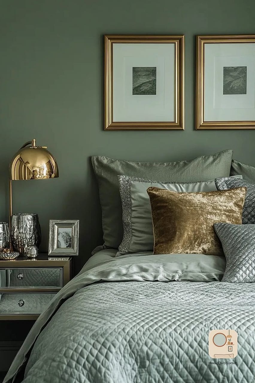
Sage has quietly become one of the most requested bedroom colors, and it’s easy to see why. It’s earthy without being boring, and it pairs beautifully with warm wood tones and natural stone accents. This shade works particularly well in bedrooms that get a lot of natural light, since it can lean gray or green depending on the time of day.
Rich Terracotta for Old World Warmth
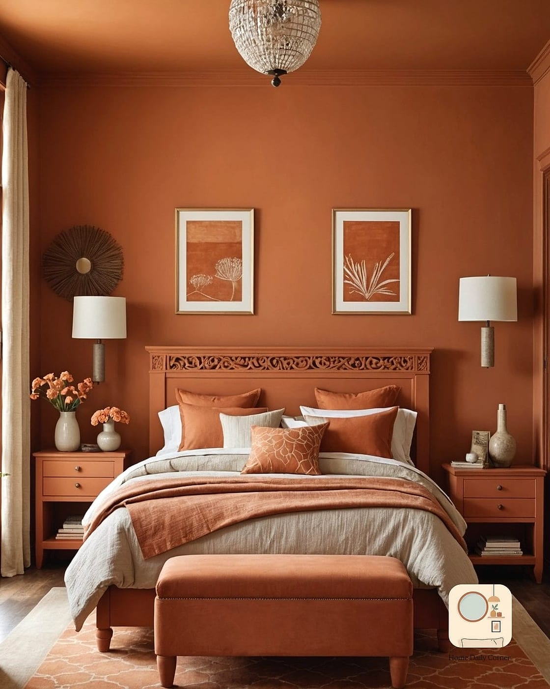
Terracotta walls bring an unexpected coziness that feels collected rather than trendy. This color works especially well paired with woven textures, rattan furniture, and matte black hardware. It’s a bolder choice, so consider it for a smaller accent wall if you’re not ready to commit to the whole room.
Soft Blush Pink Paired with Black Accents
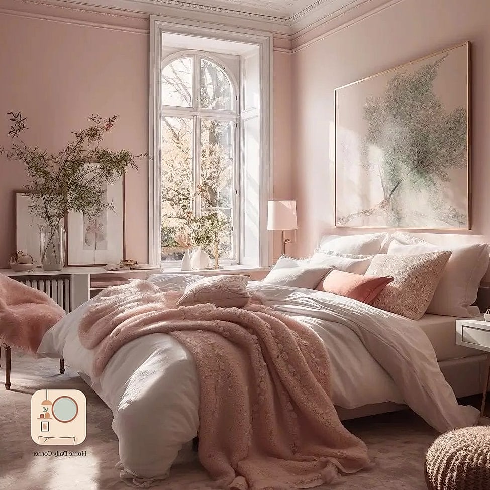
Blush pink alone can feel a little too sweet, but pair it with matte black light fixtures or a black metal bed frame and it suddenly feels grown up and editorial. This combination is popular in smaller bedrooms because the light pink keeps things airy while the black adds enough contrast to stop it from feeling flat.
Navy Blue Walls with Gold Hardware
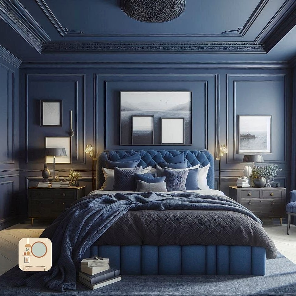
Navy is one of those colors that reads as expensive no matter the budget. It has depth, it photographs well, and it pairs beautifully with brushed brass or gold accents. Use it on all four walls for a cocooning effect, or stick to one wall if you want a lighter footprint. Either way, this combo consistently shows up in higher-end bedroom makeovers.
Warm Taupe with Layered Neutral Textiles
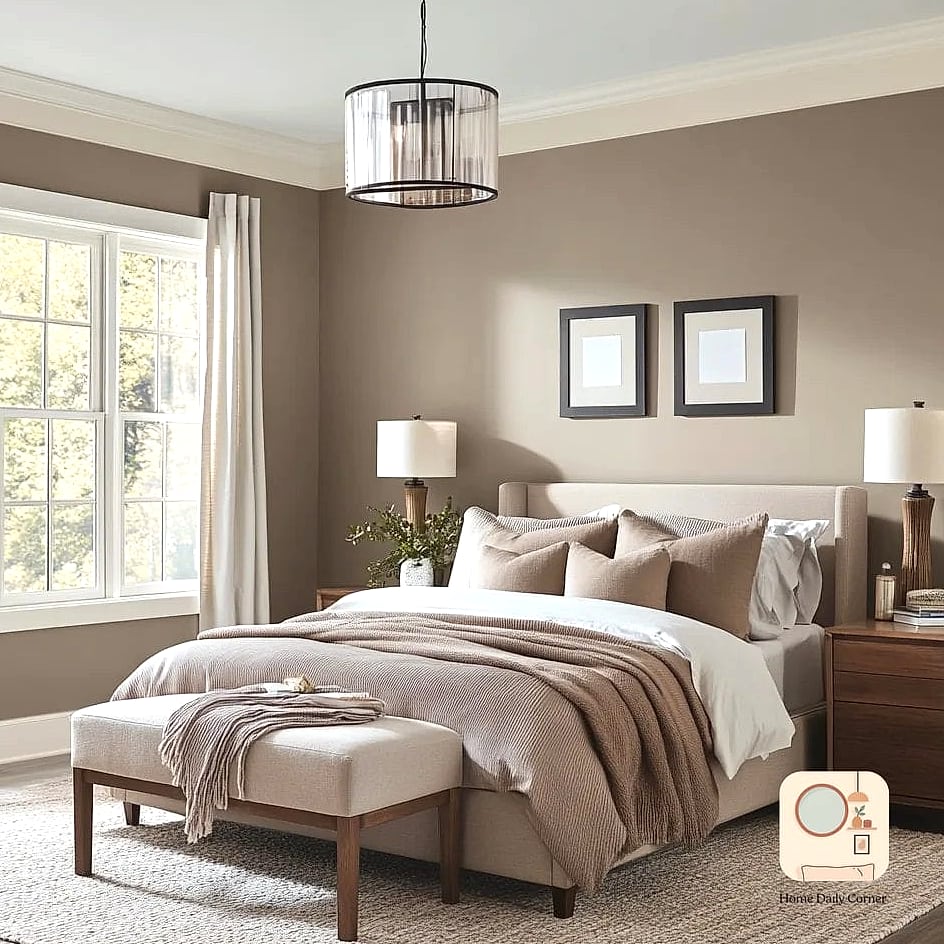
Taupe walls create a soft, inviting backdrop, especially when layered with different neutral textures like linen bedding, a chunky knit throw, and a jute rug. This is one of those rooms that looks effortless but actually takes some thought to pull off well. The key is varying the textures so the neutral palette doesn’t feel flat.
Deep Forest Green for a Moody Retreat
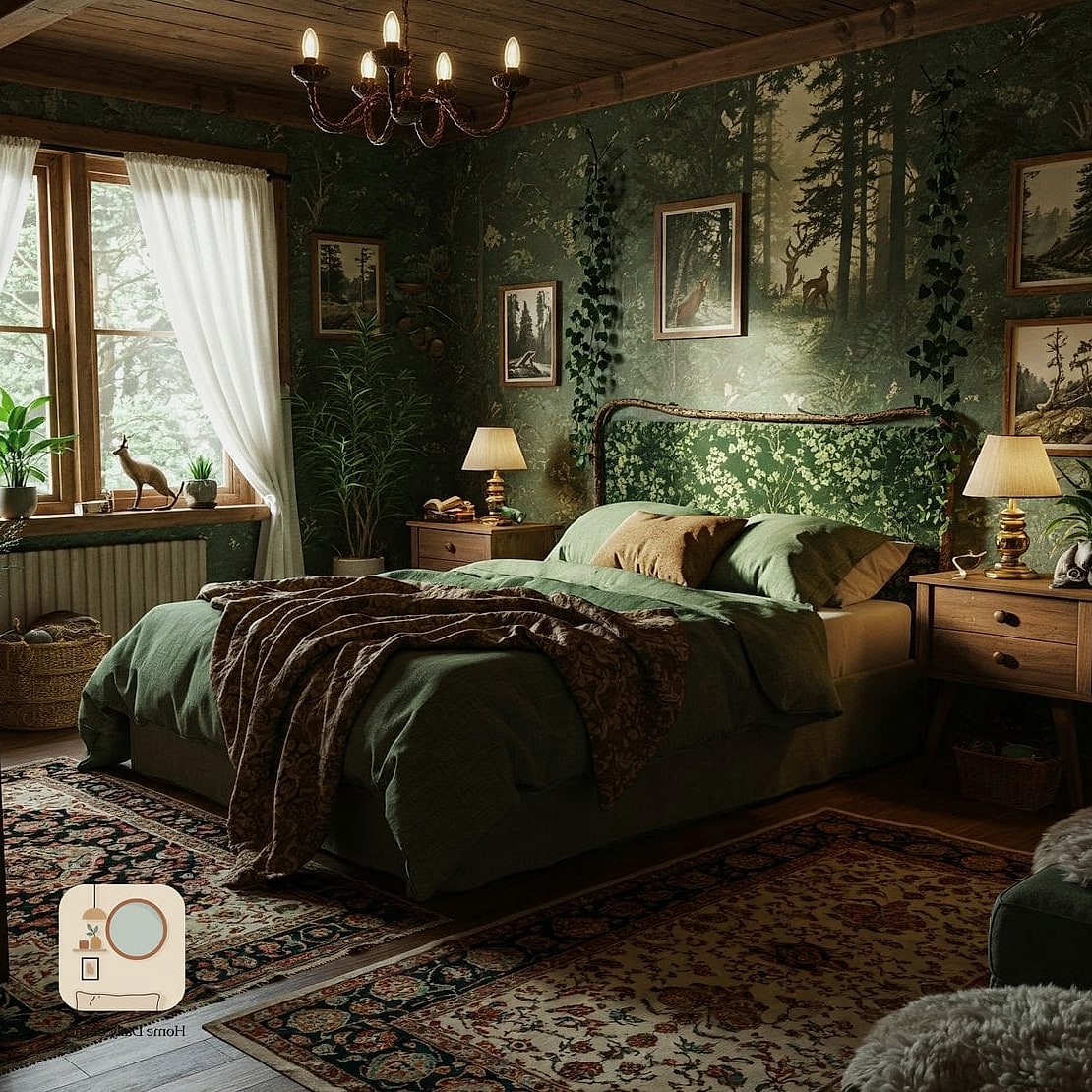
Forest green walls turn a bedroom into something that feels like an actual retreat rather than just a place to sleep. This color works especially well in rooms with good natural light, since it can otherwise feel a little heavy. Pair it with warm wood furniture and brass or bronze fixtures for a look that feels intentional rather than dark for the sake of being dark.
Creamy White with Textured Plaster Finish
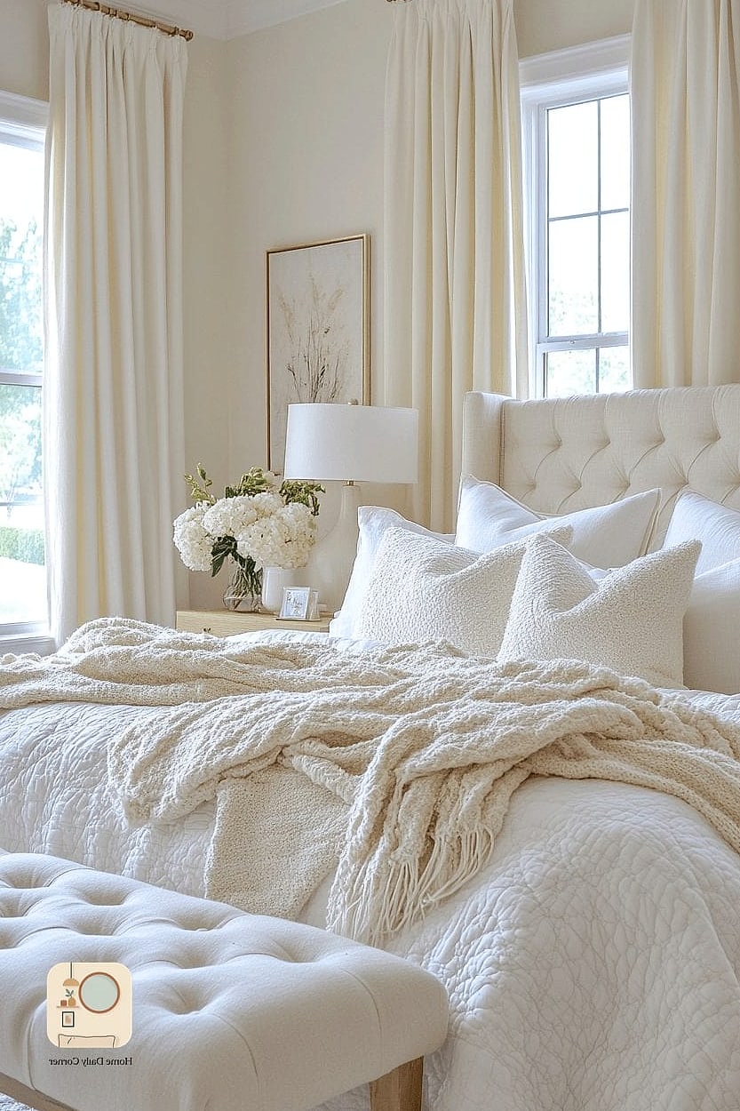
A plain white wall can look cheap fast, but a creamy white with a lightly textured plaster finish looks like something out of a design showroom. This is a great option if you want a neutral palette that still has visual interest. The texture catches light differently throughout the day, which adds a subtle richness that flat paint just can’t match.
Dusty Blue with White Millwork
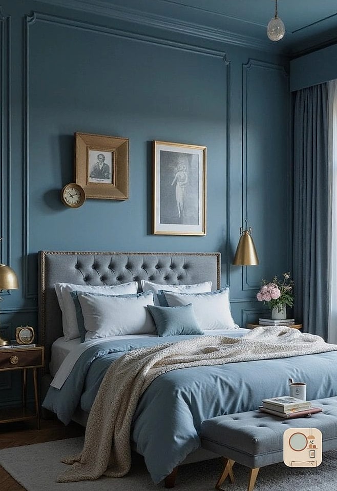
Dusty blue has a calming, slightly vintage feel that works beautifully in bedrooms. Add white millwork like a picture rail or wainscoting and the whole room takes on an almost architectural quality. This pairing works particularly well in older homes with existing trim details, but it can be added to newer builds too.
Rust Orange Accent Wall
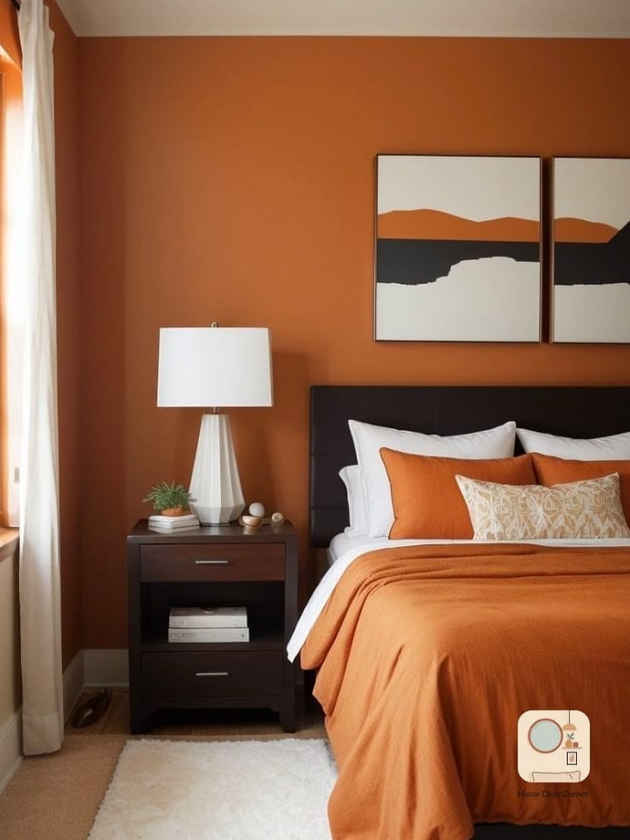
Rust is warmer and more sophisticated than a straight-up orange, and it adds serious personality to a bedroom without overwhelming it. Use it as an accent wall paired with cream bedding and warm wood tones to keep things balanced. This is a great pick if your bedroom feels a little too neutral and needs some warmth.
Soft Olive Green with Brass Details
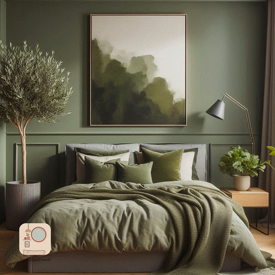
Olive green is having a real moment, and for good reason. It’s earthy and warm without being as bold as forest green. Pair it with brass drawer pulls, a brass mirror frame, or brass lamp bases, and the whole room feels curated rather than decorated in a rush.
Warm Gray with Black Window Frames
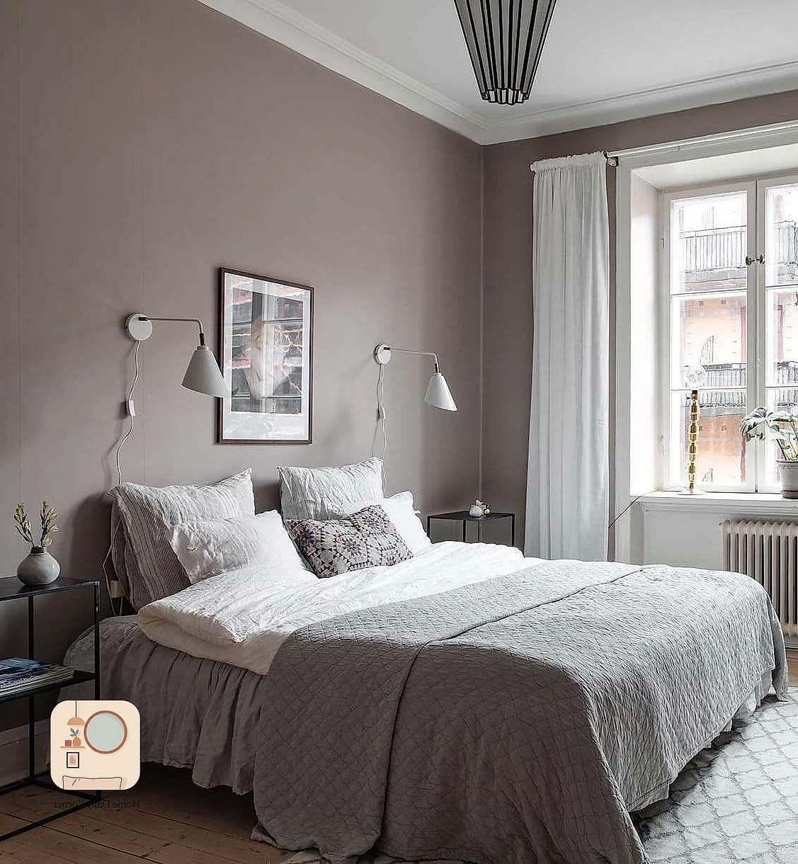
If your bedroom has black window frames or you’re considering adding them, warm gray walls are the perfect backdrop. The gray keeps things soft, while the black frames add architectural interest. This combination looks especially good in bedrooms with large windows, since the black frames become a design feature rather than just a functional detail.
Deep Plum for Dramatic Elegance
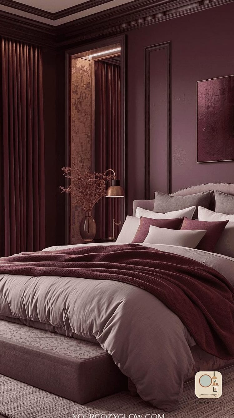
Plum walls bring drama without going full black or navy. It’s a color that reads as luxurious because it’s unexpected but not jarring. Pair it with gold or brass accents and velvet textiles for a bedroom that feels like a boutique hotel suite.
Pale Yellow with White Linens
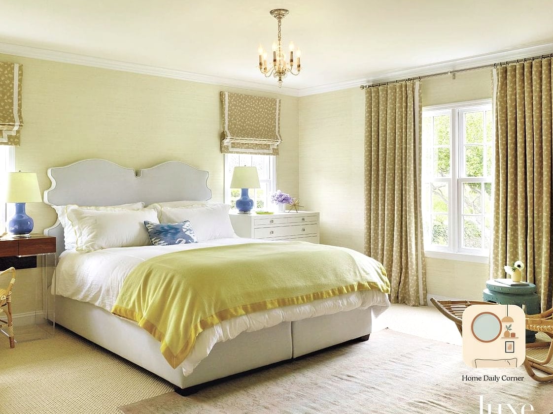
A soft, buttery yellow keeps a bedroom feeling bright and cheerful without tipping into childish territory. Keep the bedding and furniture mostly white or cream so the yellow stays the star of the show. This is a good option for bedrooms that don’t get a ton of natural light, since it can help brighten the space.
Chocolate Brown with Cream Accents
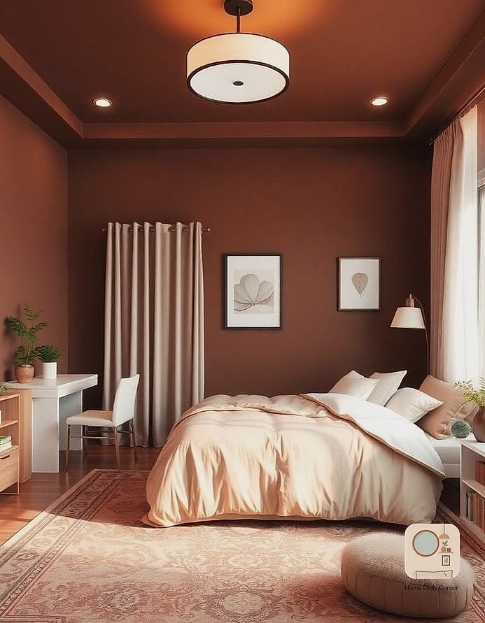
Brown walls sound like a bold choice, but a rich chocolate brown paired with cream bedding and light wood furniture is one of the most requested combinations in higher-end bedroom design right now. It’s warm, grounding, and surprisingly versatile. This works especially well in larger bedrooms where the darker walls won’t feel closing in.
Soft Lavender for a Subtle Statement
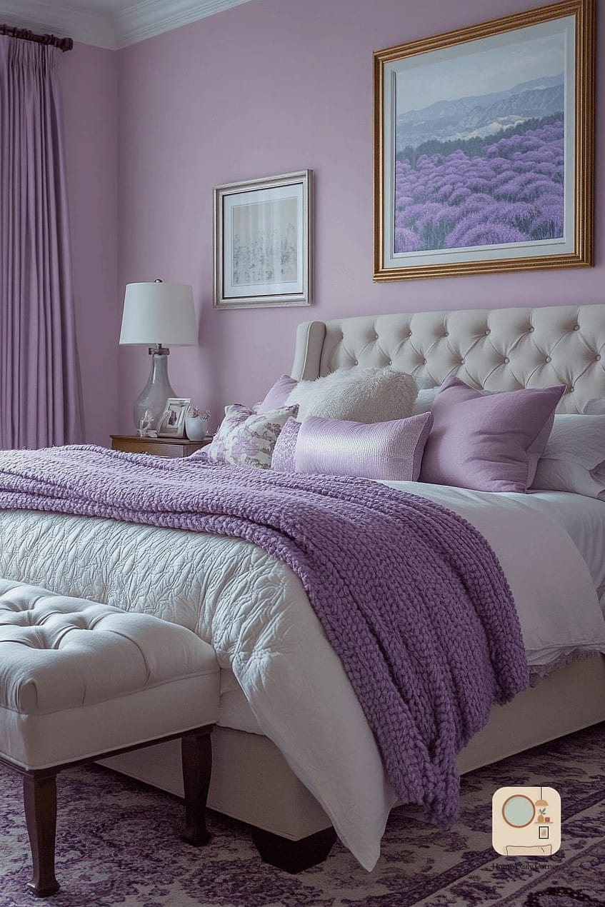
Lavender walls can feel expensive when kept muted rather than bright. A dusty, grayed-out lavender pairs beautifully with white trim and brushed nickel or brass fixtures. This is a good middle ground if you want color without committing to something too saturated.
Two-Tone Walls with a Painted Chair Rail Line
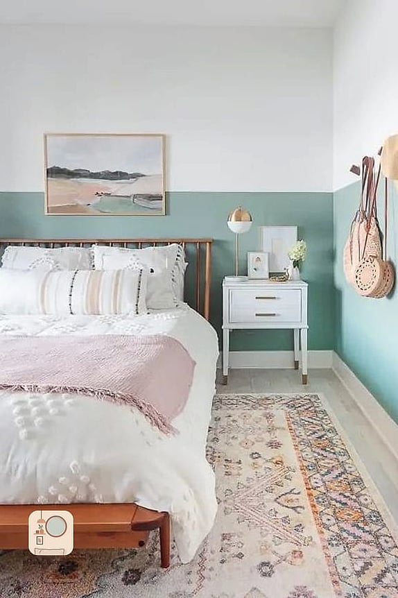
Painting the lower half of the wall one color and the upper half another, divided by a simple painted line instead of actual molding, creates a custom built-in look for a fraction of the cost. This technique works particularly well with a deeper color on bottom and a lighter shade on top, which visually grounds the room.
Warm White with Natural Wood Tones
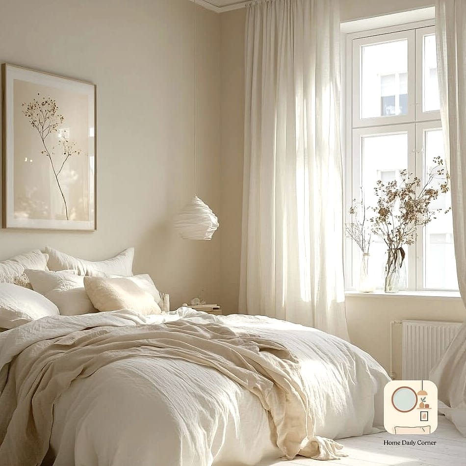
Warm white walls paired with natural wood furniture, a wood headboard, and woven textures create a Scandinavian-inspired bedroom that feels calm and expensive at the same time. The key here is making sure the white isn’t too stark or cool, since that can read as sterile rather than warm.
Slate Blue-Gray for Sophisticated Calm
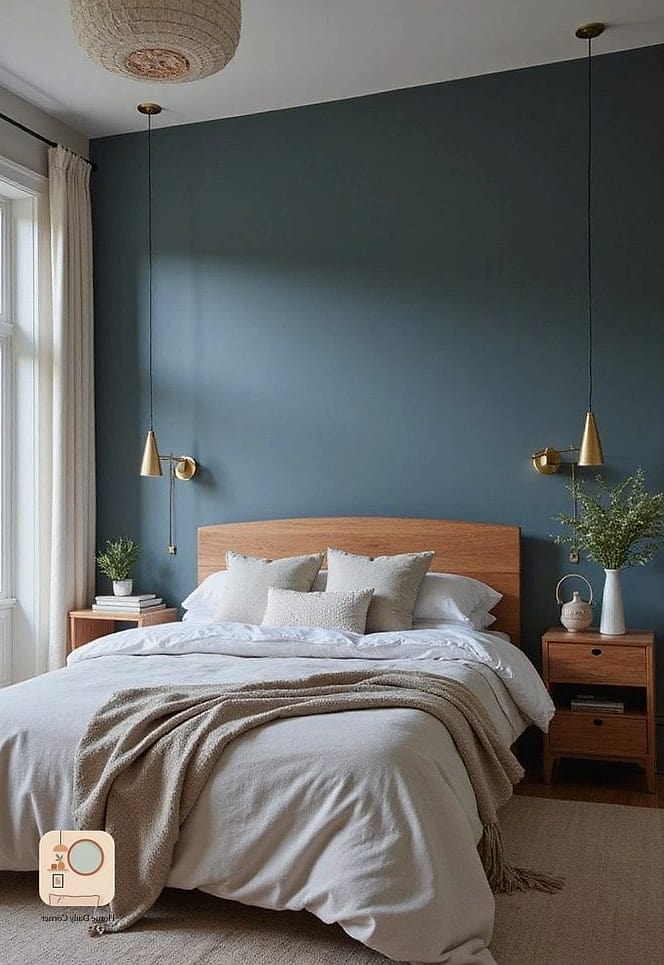
Slate is a great in-between color if navy feels too dark and gray feels too plain. It has just enough blue undertone to feel interesting without being a bold statement. Pair it with white bedding and warm wood nightstands for a balanced, put-together look.
Deep Burgundy Accent Wall
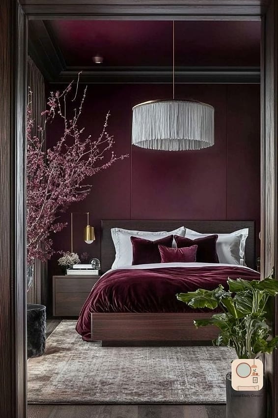
Burgundy walls bring a rich, jewel-toned depth that instantly upgrades a bedroom. Use it as an accent wall behind the bed and keep the rest of the room neutral so the color doesn’t feel overwhelming. This pairs beautifully with gold accents and dark wood furniture.
Soft Peach for Warm, Flattering Light
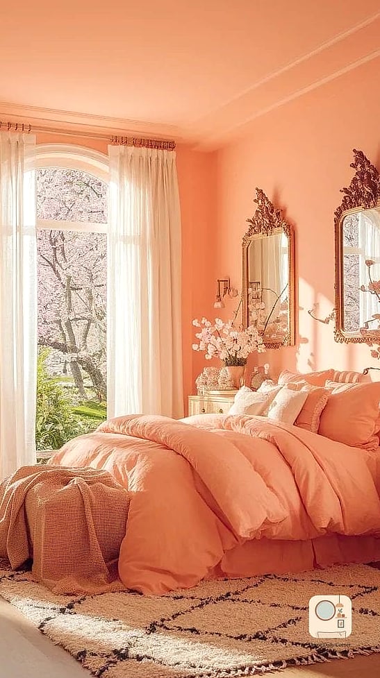
Peach walls create a warm glow that’s especially flattering in the evening when the lights are dimmed. This color works well in bedrooms that lack natural warmth, and it pairs nicely with brass fixtures and cream textiles. It’s a softer alternative to terracotta if you want warmth without quite as much intensity.
Matte Black Accent Wall with Warm Lighting
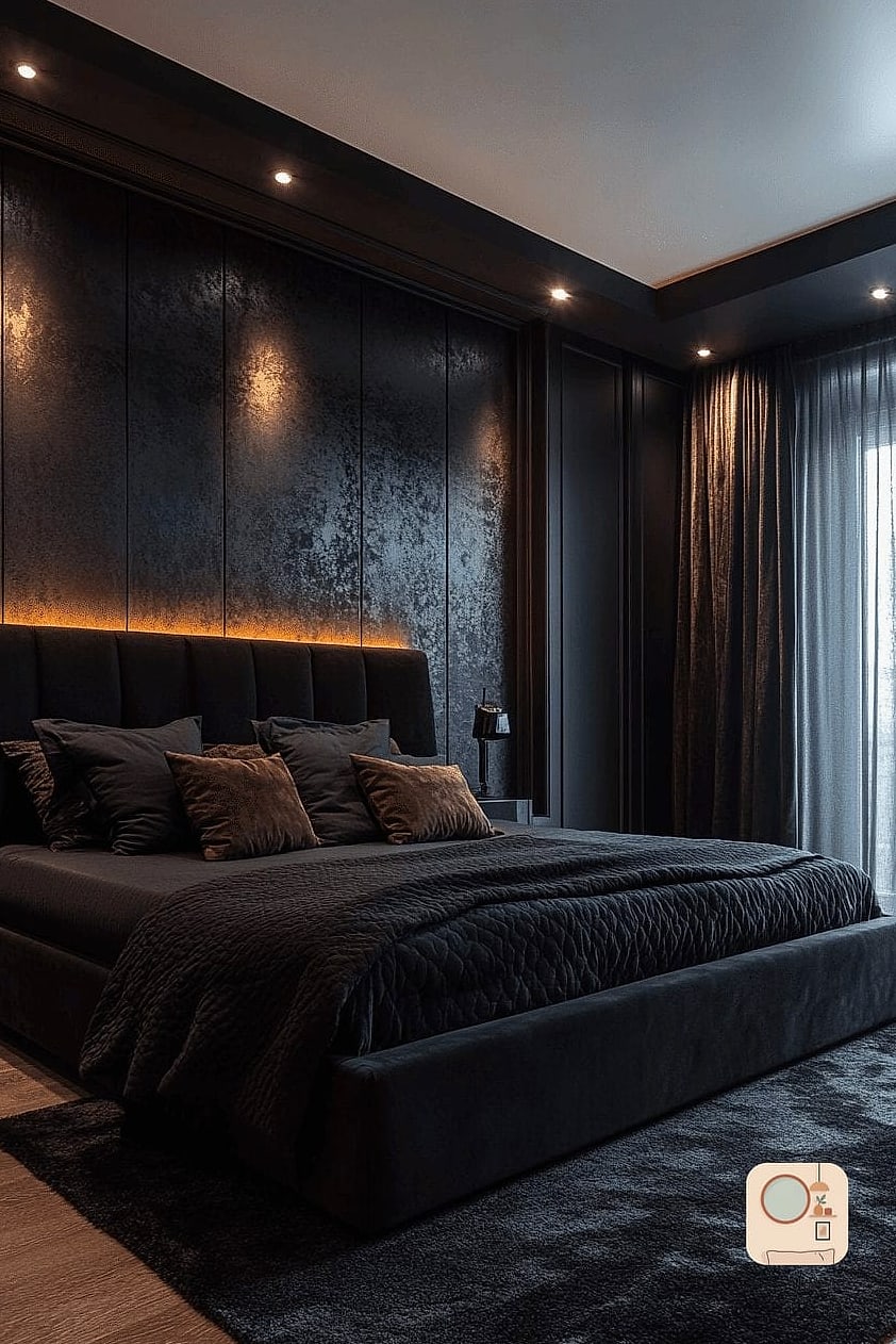
Matte black walls sound intimidating, but used as a single accent behind the bed with warm, layered lighting, the effect is moody and luxurious rather than harsh. This works best in bedrooms with decent natural light so the room doesn’t feel too dark during the day. Add a few warm-toned lamps to balance it out at night.
Soft Clay Pink for Grounded Warmth
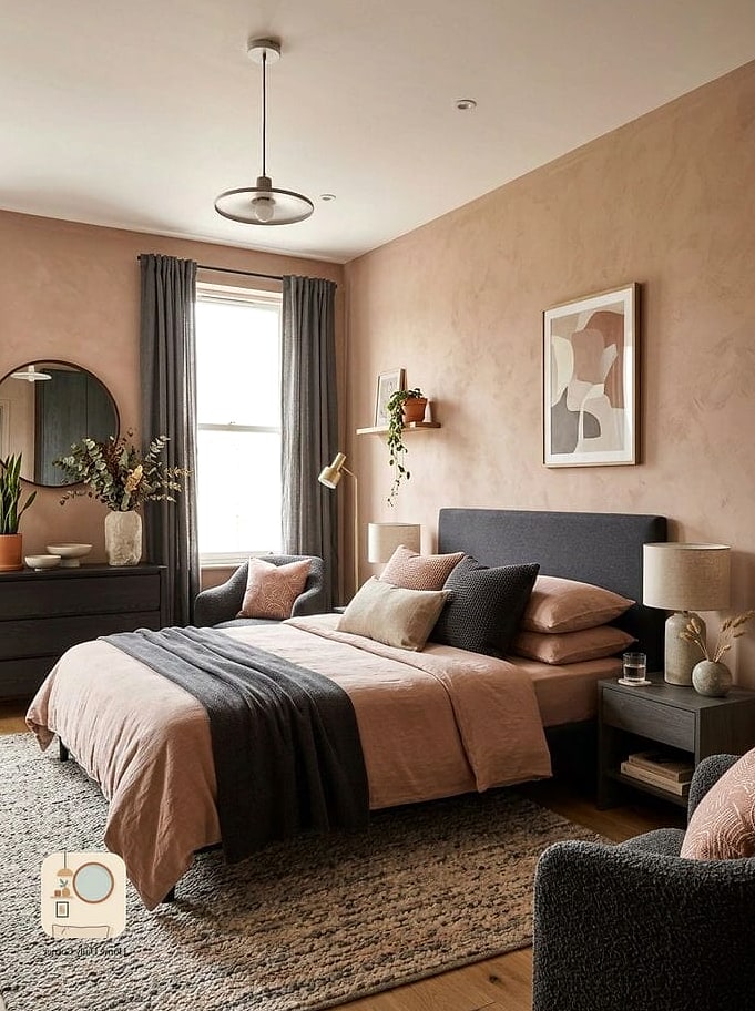
Clay pink is a more muted, earthy version of blush that feels less trendy and more timeless. It pairs beautifully with natural materials like linen, wood, and stone. This color choice tends to age well, which matters if you’re not planning to repaint anytime soon.
Ivory with Textured Wallpaper Accent
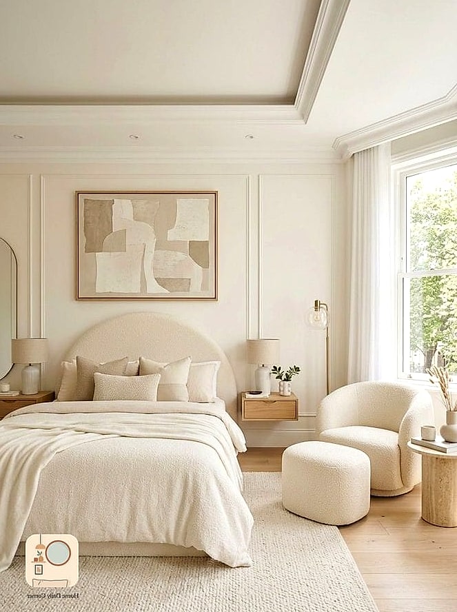
Sometimes the upgrade isn’t a bold paint color at all, it’s swapping flat paint for a textured or subtly patterned wallpaper in an ivory tone. This adds dimension and visual interest while still keeping the palette neutral and calm. Peel-and-stick options make this renter-friendly if you’re not able to commit to a full install.
Deep Teal for Bold, Sophisticated Contrast
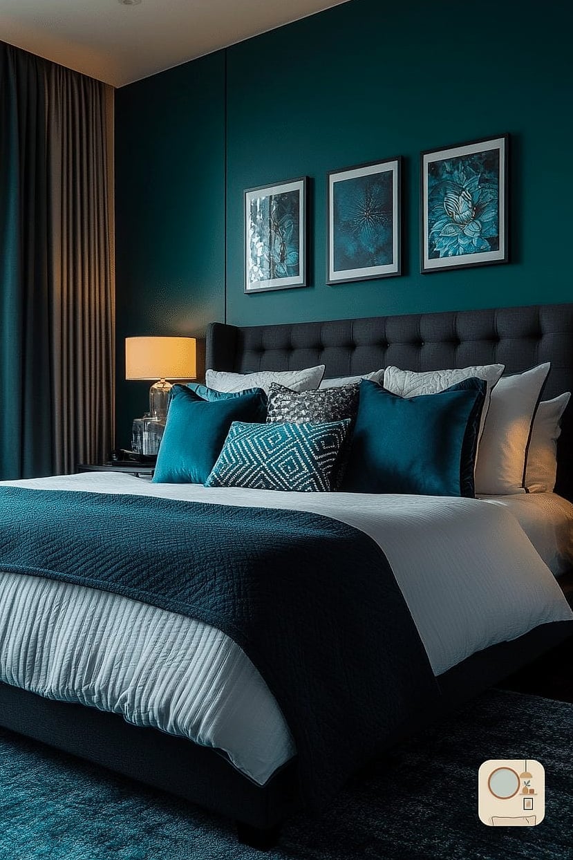
Teal has enough blue and green in it to feel fresh rather than dated. Used on all four walls, it creates a cocooning, jewel-box effect that pairs beautifully with brass or gold accents and warm wood furniture. This is a great option if you want a bold color that still feels considered rather than trendy.
Soft Gray-Green with Layered White Textiles
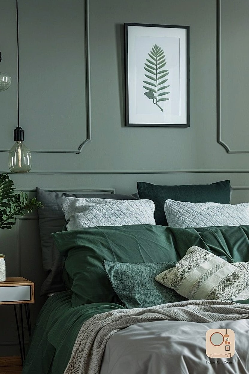
This color sits somewhere between sage and gray, and it’s incredibly versatile because it shifts depending on the light. Layer in plenty of white and cream textiles, like a duvet, throw pillows, and a soft rug, and the room ends up feeling airy, calm, and more expensive than the paint can price tag would suggest.
Choosing the right bedroom color doesn’t have to mean a total renovation. A single accent wall, a fresh coat on the trim, or swapping out hardware to match a new palette can shift the entire feel of the room. The real trick is picking colors that work with your lighting and pairing them with textures and finishes that feel intentional. Start with one wall if you’re not ready to commit, and build from there.